|
Web Lesson #10 Representing Data
WL#10 › Histograms
The Interactive Web-Lesson below has questions embedded
|
Shoe Size |
5 |
6 |
7 |
8 |
9 |
frequency |
2 |
10 |
18 |
15 |
5 |
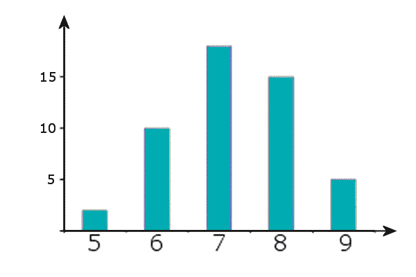
But for grouped data (continuous or discrete), like this:
Income (£1000's) |
0 - 5 |
5 - 15 |
15 - 20 |
20 - 30 |
frequency |
25 |
100 |
80 |
60 |
We cannot draw a bar chart. We must instead draw a histogram
Drawing Histograms
- For each class, find its ‘class width’
         ╒══════════════╕   ╒══════════════╕
CLASS  = │upper boundary│ — │lower boundary│
WIDTH    └─┐ of class ┌─┘   └─┐ of class ┌─┘
           ╘══════╦═══╛       ╘═══╦══════╛
                  ╚══════╗        ║
                     ╔════════════╝
                     ▼   ▼
Salary (£1000's)
0 - 5
5 - 15
15 - 20
20 - 30
frequency
25
100
80
60
Class Widths
5
10
5
10
Salary (£1000's) |
0 - 5 |
5 - 15 |
15 - 20 |
20 - 30 |
|
frequency |
25 |
100 |
80 |
60 |
       Frequency
     class width
 = Frequency density
|
Class Widths |
5 |
10 |
5 |
10 |
|
Frequency Densities |
5 |
10 |
16 |
6 |
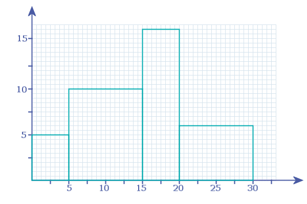
So, the first bar is from 0 - 5 and has height = 5 units:
The next bar is from 5 - 15 and has height 10 units:
Etc:
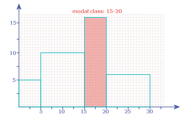
The Histogram shows us that the modal class is NOT the class with the highest frequency, but the class with the highest frequency density
In this case, the modal class was ‘15 - 20’ (whereas the class with the highest frequency was ‘5-15’)
Finding Frequencies on a Histogram
When looking at the histogram, it is important to realise that the frequencies are not on the y-axis. If we want to find the frequencies from the histogram, then we need to the 'area' of each bar
So, looking at the '0 - 5' bar: its width = 5 and its height = 5:
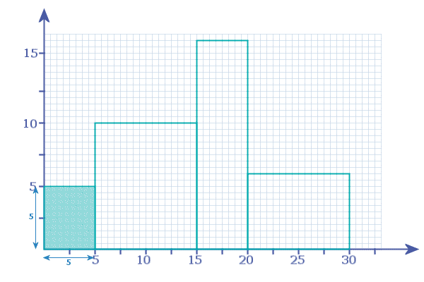
so it represents a frequency of '25':
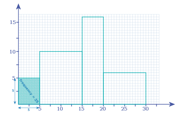
Looking at the '5 - 15' bar: width = 10 and height = 10, so it represents a frequency of '100'
Looking at the '15 - 20' bar: width = 5 and height = 16, so it represents a frequency of '80'
Looking at the '20 - 30' bar: width = 10 and height = 6, so it represents a frequency of '60'
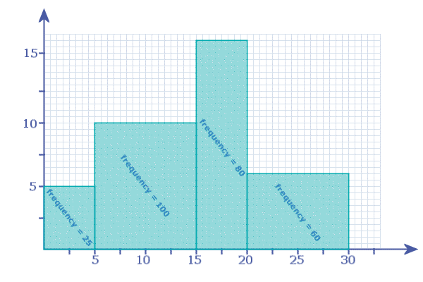
See...
Question 1: Complete this table:
Weight |
0 - 10 |
10 - 15 |
15 - 20 |
20 - 30 |
30 - 50 |
50 - 100 |
frequency |
80 |
45 |
55 |
60 |
40 |
100 |
CLASS WIDTH |
10 |
... |
5 |
... |
... |
50 |
FREQUENCY DENSITY |
8 |
9 |
... |
... |
... |
2 |
Clues:

The class width for the 1st class is given ("10")

For the 2nd class, the class width is: 15 - 10 = 5

Etc…

The frequency densities for the 1st and 2nd classes are given

For the 3rd class, the frequency density is: 55 ÷ 5 = 11

Etc…
Question 2: Using the grid provided (here), draw a histogram to illustrate the data in Question 1
b) Explain why the 50-100 class (which has the highest frequency) is NOT the modal-class
c) State the modal-class
Clues:

FIRSTLY - download and print off the GRID PROVIDED by clicking on the link in the question!

The 1st bar spans from "0" to "10" on the x-axis…
                          …and it reaches up to a FD of "8" on the y-axis

The 2nd bar spans from "10" to "15" on the x-axis…
                          …and it reaches up to a FD of "9" on the y-axis

Etc…


The modal class is the class with the highest FREQUENCY DENSITY, or, on your histogram,
the class which has the tallest bar

Since the class widths are not equal, the class with the highest frequency is not necessarily
the modal class - it is the frequency densities that decide which is the modal class
Question 3: Using the grid provided (here) , draw a histogram to illustrate this data
Hence, explain why the 60-100 class (which has the highest frequency) is NOT the modal class
Age |
0 - 20 |
20 - 30 |
30 - 40 |
40 - 50 |
50 - 60 |
60 - 100 |
frequency |
10 |
24 |
28 |
25 |
20 |
32 |
Clues:

FIRSTLY - download and print off the GRID PROVIDED by clicking on the link in the question!

The class width of the first class is 20

The other class widths are; 10, 10, 10, 10, 40

So, the frequency density of the first class is 10/20 = ½

The other frequency densities are; 2.4, 2.8, 2.5, 2.0, and 0.8

To draw your histogram, scale an x-axis to read from '0' to '100' and a y-axis from '0' to 3'

The first bar has width '20' [from x=0 to x=20] and height '½'

The second bar has width '10' [from x=20 to x=30] and height '2.4'

Etc…
Question 4: A large group of teenagers were asked how much birthday money they received
The histogram below summarises the data:
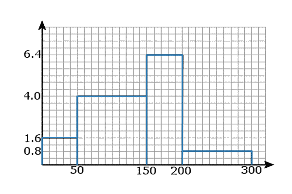
Use the histogram to complete the frequencies in the table below:
Birthday Money (£) |
0 - 50 |
50 - 150 |
150 - 200 |
200 - 300 |
frequency |
... |
... |
... |
... |
Clues:

We know that:
On a Histogram
Area ◄——————————► Frequency
So, we need to work out the AREA of each bar to find its frequency:

                                                       ╒═══════════════════════╕
The area of the 1st bar is: 50 × 1.6  =  80  ◄—————————┤ So, the 1st frequency │
                                                       │  in out table is: 80  │
                                                       ╘═══════════════════════╛
Etc…
Drawing Frequency Polygons
Once you have drawn a histogram (like the one we drew above) it is easy to convert it to a frequency polygon:
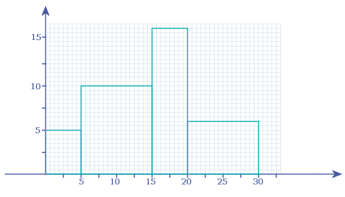
Notice I have EXTENDED my \(x\)-axis a little bit in readiness for drawing the frequency polygon:
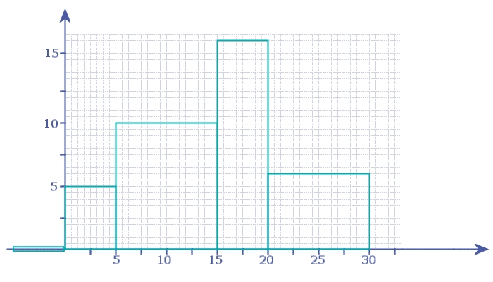
- Step 1: Add in a new bar, to the left of the first bar. This new bar has to be the same width as the first bar, but the height of the new bar is zero!
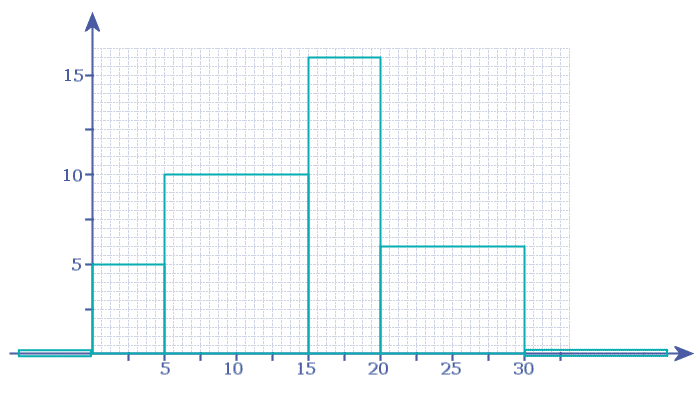
Notice my new bar is a bit taller than it should be - that's to make it stand out so you can 'see' it! - Step 2: Add in another new bar, to the RIGHT of the last bar. This new bar has to be the same width as the last bar, but the height of the new bar is zero!
- Step 3: Now place a ‘●’ in the top-centre of each bar:
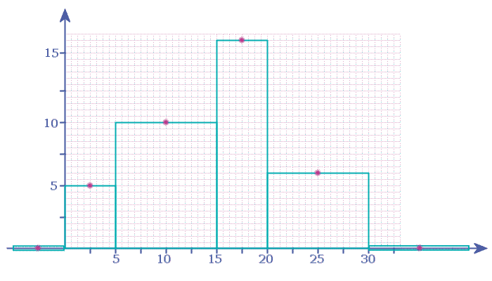
- Step 4: Finally, connect these together with straight lines
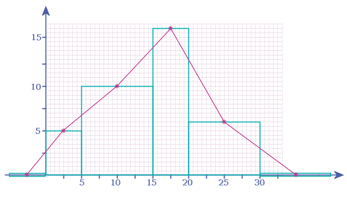
- That's it, our frequency polygon is now drawn - if you like, you can rub out the original histogram, leaving only the frequency polygon
Question 5: Convert your histogram from Question 1 to a frequency polygon
Question 6: Convert your histogram from Question 3 to a frequency polygon
Histogram with the Axes not Numbered
If one or both of the axes on a histogram is not labelled, then the question will give at least one frequency to enable you to work out the rest of the frequencies
e.g. A survey was conducted into how long it takes students to complete this "Web Lesson". The results are shown on the histogram below:
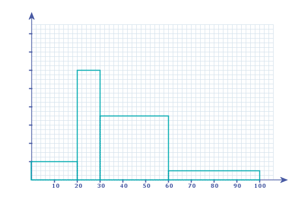
Given that 48 students said it took between 20-30 minutes to complete this "Web Lesson", write a grouped frequency table for the data
There are TWO ways we can tackle this problem:
Method 1: Number the \(y\)-axis
They tell us that 48 students took 20-30 minutes:
On a Histogram
Area ◄——————————► Frequency
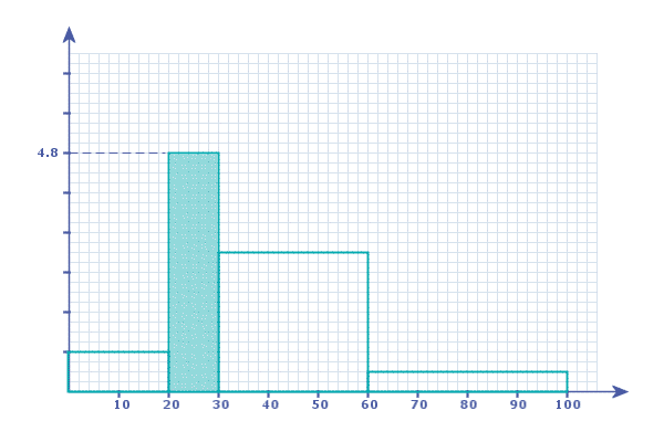
So we know that the area of the 2nd bar must be 48:
                                      ╒════════════════════════╕
                                      │ This area is 48 people │
                    ╔═════════════════╡      10 × y =  48      │
                    ║                 │     ÷10       ÷10      │
                    ▼                 │     -------------      │
                                      │           y = 4.8      │
                                      ╘════════════════════════╛
|
So, we know the y-value for the height of THIS Bar:
Which means we can number the y-axis:
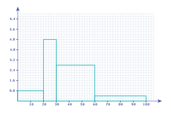
So, we can now easily work out the area of each bar and complete a frequency table...
Method 2: Counting Squares
Again, starting with the information they gave us about the histogram: 48 students took between 20-30 minutes
So, we know the area of the 2nd bar is 48 units²
Now we can divide up the 2nd bar into 'squares'...
We can either use the tiny little squares of the grid, or (as I have done) use the large squares created by the grid markings:
                                      ╒════════════════════════╕
                                      │ This area is 48 people │
                    ╔═════════════════╡    6 squares  =  48    │
                    ║                 │   ÷6             ÷6    │
                    ▼                 │   -----------------    │
                                      │   each square =  8     │
                                      ╘════════════════════════╛
|
So, each of these squares ![]() represents 8 students:
represents 8 students:
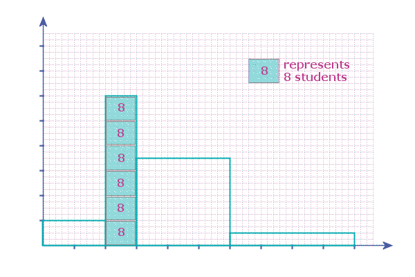
So all we need to do now is to count how many of these squares there are in the other bars:
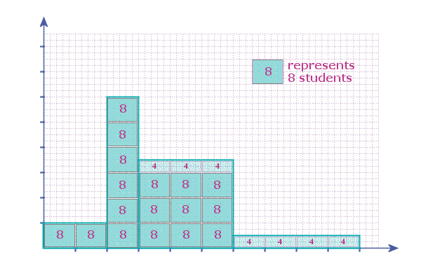
And it is then easy to write a frequency table for the data...
Question 7: A teacher is complaining that most of his students live too far from the school...
He asked all the Year-10 students at Nowhere Hill school were asked "how far do you travel to school".
The results are shown in the histogram below:
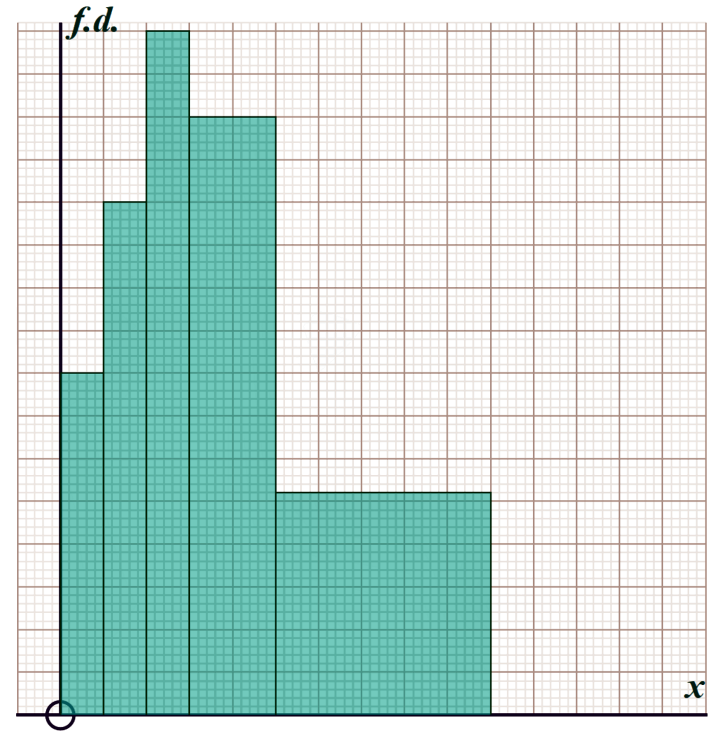
You can print-off the histogram here
By first ‘scaling’ the \(x\)- and \(y\)-axes, complete the frequencies in the table below:
distance (km) |
0-2 |
2-4 |
4-6 |
6-10 |
10-20 |
20+ |
frequency |
... |
... |
... |
56 |
... |
0 |
And work out what proportion of these Year-10 students live more than 2 km from school?
Clues:

FIRSTLY - download and print off the histogram by clicking on the link in the question!

We can easily number the x-axis:
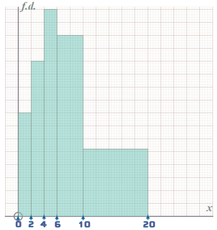
Now, since they tell us the FREQUENCY for the 4th bar is 56:
                                       ╒══════════════════════════╕
                                       │ This area is 56 students │
                             ╔═════════╡        4 × y =  56       │
                             ║         │       ÷4        ÷4       │
                             ║         │      -------------       │
                             ▼         │            y = ...       │
                                       ╘══════════════════════════╛
|
So, we know the y-value for the height of THIS Bar…
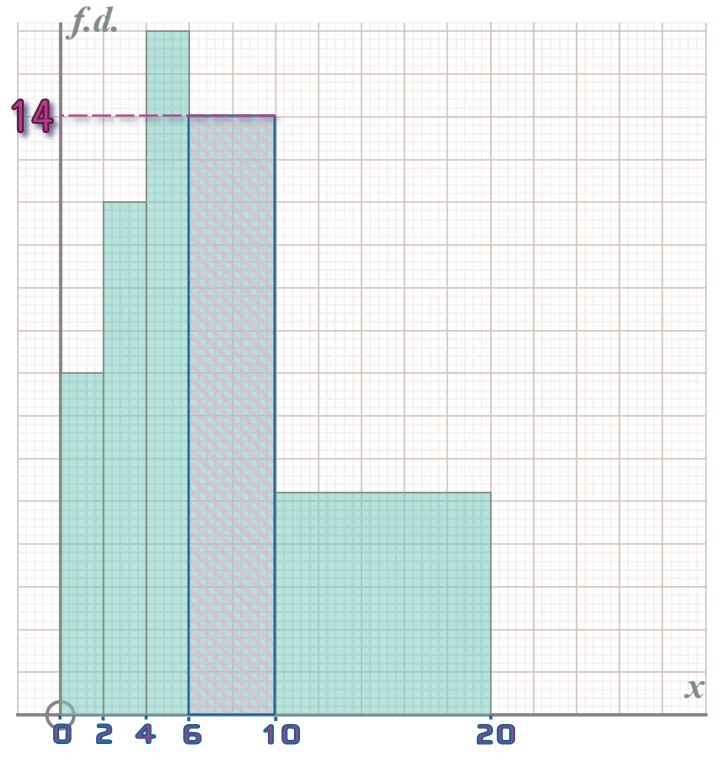
Which means we can number the y-values for all of the notches along the y-axis…

Allowing us to work out the area of each of the bars and fill in the frequencies in the table…
Question 8: Some students were asked to weigh their school bags and the results are summarised in the histogram below (which you can print off here):
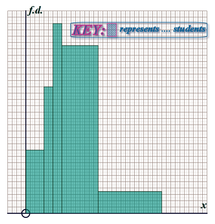
The scales on both of the axes have been lost, but part of the frequency table remains:
mass (kg) |
0-2 |
2-3 |
3-4 |
4-8 |
8-15 |
frequency |
20 |
... |
... |
... |
... |
This time, we are going to use the ‘COUNTING-SQUARES’ method to populate missing frequencies in the table:
a) Use the top row of the table to help you label the \(x\)-axis
b) Use the single frequency given in the table (i.e. 0-2 kg class has a frequency of ‘20’) to work out the frequency represented by the blue-square  in the top right hand corner of the histogram
c) Hence fill in the missing frequencies in the table
Darius says, "clearly someone has made a mistake with this data"
d) Why did he say that?
Clues:

FIRSTLY - download and print off the HISTOGRAM by clicking on the link in the question!

Part (a): We can see from the table that the first bar spans from "0" to "2" on the x-axis

And, the second bar spans from "2" to "3" on the x-axis

Etc…

So, we can label the x-axis:
0 2 3 4 8 15
|
Part (b): The table tells us that the "0-2" class has a frequency of 20 bags We need to figure out how many of these blue-squareswill fit into the first bar:
0 2 3 4 8 15
|
We can fit 10 of these blue-squaresinto the 1st bar: 10 blue-squares ——————————► 20 bags ─┐ ├×1 1 blue-squares ——————————► __ bags ◄┘ 10 So: Each blue-square
represents 2 student's bags:
0 2 3 4 8 15
|
Part (c): Looking at the second bar, we could also fit 10 blue-squaresinto it: 1 blue-square ——————————► 2 bags ─┐ ├×10 10 blue-squares ——————————► __ bags ◄┘ Which gives us the 2nd frequency in our table:
mass (kg) |
0-2 |
2-3 |
3-4 |
4-8 |
8-15 |
frequency |
20 |
20 |
... |
... |
... |
Part (d): Looking at the third bar, we could fit ⍰ blue-squaresinto it: 1 blue-square ——————————► 2 bags ─┐ ├×⍰ ⍰ blue-squares ——————————► __ bags ◄┘ Which gives us the 3rd frequency in our table… So, using the same method, we can fill in the remaining frequencies…
Question 9: A group of 120 teenagers were asked how many minutes they spent on the 'phone yesterday.
The results are summarised in the histogram below (which you can print off here)
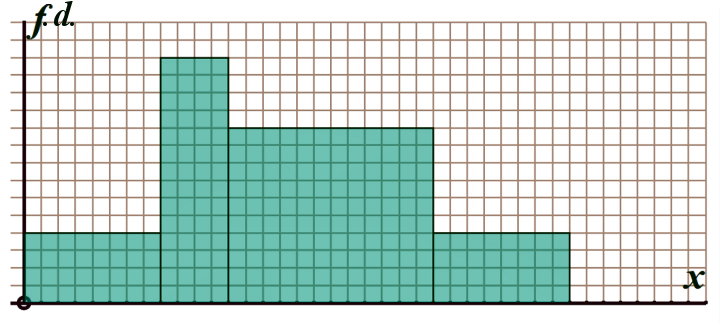
a) Using the table below, scale the \(x\)-axis of the histogram:
time (mins) |
0-20 |
20-30 |
30-60 |
60-80 |
frequency |
... |
... |
... |
... |
b) By working out the total number of 'small squares' that are contained by the bars of the histogram and equating this to the total frequency of 120 teenagers, work out the number of teenagers represented by 1 'small square'
c) Hence fill in all the frequencies in the table
Clue:

Probably the easiest way to work out ‘how many squares’ are contained in each bar is to multiply
the width (in squares) by the height (in squares)
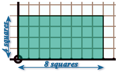
This the 1st bar contains: 32 squares

Once you've worked out the total number of square in all 4-bars, use the scale factor method:

                        ⍰ blue-squares	——————————►  120 teenagers ─┐
                                                                    ├×⍰
                       32 blue-squares  ——————————► ____ teenagers ◄┘
                      └───────┬───────┘
i.e. the ‘0-20’ class: ───────┘
Question 10: In a study on hand-to-eye coordination, \(120\) Year 11 students were given this test:
A dot appears in a random position on one side of a screen. The dot moves quickly across the screen taking 5 seconds to reach the other side. You (i.e. the subject) have to aim a virtual-laser at the screen, moving it until you hit the dot. The time it takes you to 'hit' the dot is recorded by the computer...
If a subject takes more than 5 seconds to hit the dot, then the computer assumes they are dead and NO TIME IS RECORDED for that subject - they are deleted from the records, and in real-life! 
The results of the study are displayed on this histogram - you can print if off here
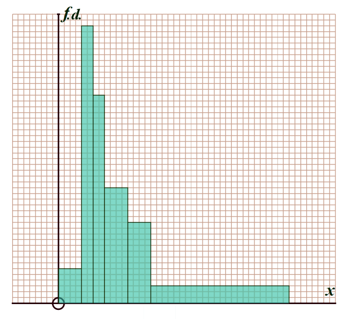
Sadly, someone rubbed out all of the numbers on the histogram...
However, the researcher ‘remembered’ that number of subjects in the \(\frac{1}{4}\leqslant x<\frac{1}{2}\) class was (a huge) 21 less than the number in the \(\frac{1}{2}\leqslant x<\frac{3}{4}\) class
Out of the \(120\) students that took the test, how many had NO TIME RECORDED (i.e. took more than 5 seconds, so were assumed to be dead and thus are NOT part of the histogram)?
Hints:

Firstly - we know that the BARS on the x-axis only go up to x = 5

Which allows us to scale the x-axis easily…

You notice the first class is ‘0-½’ and there isn't ACTUALLY a ‘¼-½’ class on the histogram…

But, it is FINE to simply chop the ‘0-½’ class into 2 classes by adding in a vertical line at x=¼


Next we know that:
 ┌──────────────────────────────────┐   ┌────┐  ┌──────────────┐  ┌──────────────────────────────┐
 │ № of students in the ‘¼-½’ class │   │ IS │  │ 21 less than │  │ № of students in ‘½-¾’ class │
 └────────────────╥─────────────────┘   └────┘  └──────────────┘  └──────────────╥───────────────┘
                  ║                                             ╔════════════════╝
                  ║                            ╔════════════════╝
                  ╚═══════╗   ╔════════════════╝
                          ║   ║
                          ║   ▼
                          ║
                          ║
                          ║
                          ║
                          ║
                          ║
                          ║
                          ║
                          ║
                          ║
                          ║
                          ║
                          ║
                          ║
                          ║
                          ║
                          ║
                          ║
                          ║
                          ║
                          ║
                          ║
                          ║
                          ║
                          ║
                          ║
                          ║
                          ║
                          ║
                          ║
                          ║
                          ║
                          ║
                          ║
                          ║
                          ▼
|
